Popular Data Visualization Tools for New Data Scientists
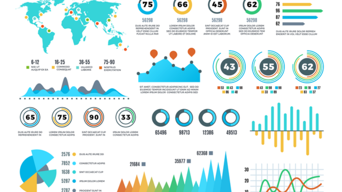
In today’s data-driven world, the ability to visualize data effectively is a crucial skill for any aspiring data scientist. With vast amounts of information at our fingertips, transforming raw data into meaningful visual representations can help uncover insights, tell compelling stories, and drive informed decision-making. If you’re a new data scientist eager to master this essential skill, you’re in the right place! At Madros Technologies, we’ll explore some of the most popular data visualization tools that can help you create impactful charts and dashboards with ease.
Why Data Visualization Matters
Data visualization is more than just creating pretty charts; it’s about making complex data more accessible and understandable. Here are a few reasons why data visualization is essential for data scientists:
- Enhanced Understanding: Visuals can simplify complex data sets, making it easier to identify trends, patterns, and outliers.
- Effective Communication: A well-designed chart or dashboard can convey insights more effectively than tables of numbers, helping stakeholders grasp key points quickly.
- Informed Decision-Making: By visualizing data, organizations can make data-driven decisions that are backed by evidence rather than intuition.
Key Features of Effective Data Visualization
Before diving into specific tools, it’s important to understand what makes a good data visualization:
- Clarity: The visualization should clearly communicate the intended message without unnecessary clutter.
- Accuracy: It’s vital that the data is represented accurately to avoid misleading interpretations.
- Engagement: An engaging design can capture the audience's attention and encourage them to explore the data further.
Popular Data Visualization Tools
1. Tableau
Tableau is one of the leading data visualization tools, known for its powerful capabilities and user-friendly interface. It allows users to connect to various data sources and create interactive dashboards with drag-and-drop features. Tableau’s strength lies in its ability to handle large datasets and perform complex analyses while still being accessible for beginners.
- Key Features:
- Interactive dashboards
- Real-time data analysis
- Extensive integration options with various data sources
2. Microsoft Power BI
Microsoft Power BI is another popular choice among data scientists and business analysts. This tool enables users to create visually stunning reports and dashboards that can be shared across organizations. Power BI integrates seamlessly with other Microsoft products, making it a convenient option for those already using the Microsoft ecosystem.
- Key Features:
- User-friendly interface
- Built-in AI capabilities for advanced analytics
- Robust sharing and collaboration options
3. Google Data Studio
Google Data Studio is a free tool that allows users to create customizable reports and dashboards using data from various Google services, such as Google Analytics and Google Sheets. It’s particularly beneficial for those who want to visualize web analytics data and share insights easily.
- Key Features:
- Real-time collaboration with team members
- Easy integration with Google products
- Customizable templates for quick report creation
4. D3.js
For those who prefer a more hands-on approach to data visualization, D3.js is a powerful JavaScript library that allows developers to create dynamic and interactive data visualizations on the web. While it has a steeper learning curve compared to other tools, D3.js offers unparalleled flexibility and customization options.
- Key Features:
- Customizable visualizations through code
- Ability to handle large datasets
- Extensive community support and resources
5. Matplotlib and Seaborn (Python Libraries)
If you’re inclined towards programming, Matplotlib and Seaborn are two popular libraries in Python for creating static, animated, and interactive visualizations. Matplotlib provides a solid foundation for creating a wide range of plots, while Seaborn builds on Matplotlib, offering a higher-level interface for more attractive and informative statistical graphics.
- Key Features:
- Wide variety of chart types
- Integration with Jupyter notebooks for interactive data exploration
- Customization options for styling and aesthetics
Getting Started with Data Visualization
Now that you’re familiar with some of the most popular data visualization tools, it’s time to start practicing! The best way to learn is by doing. Experiment with different tools, create your own visualizations, and explore various datasets to see how different visualizations can tell different stories.
Learn and Earn Your Professional Certification
At Madros Technologies, we’re committed to helping you succeed in your data science journey. Our courses are designed to provide hands-on experience with data visualization tools and techniques, ensuring you gain the skills needed to excel in this field.
Are you ready to take your data visualization skills to the next level? Check our courses here and discover the perfect course to kickstart your career in data science!
Conclusion
Data visualization is a vital skill for new data scientists, enabling them to transform complex data into meaningful insights. By mastering popular tools like Tableau, Microsoft Power BI, Google Data Studio, D3.js, and Python libraries, you’ll be well-equipped to create impactful visualizations that resonate with your audience.
At Madros Technologies, we’re dedicated to supporting your growth in the tech industry. Explore our courses, earn your certification, and become a confident data scientist ready to tackle the challenges of the digital world. Your journey starts now!
If you found this content useful, please do well to share:
Blog Search
Latest Posts

Unlocking Your Migration Dreams: From Osun Tech Space to Global Spaces
October 13, 2025Gain visa insights, tech skills, & funding for global success. Join Our Webinar with VESTI on October 18th and unlock your migration dreams for a global fut

Unlock Your Tech Future: Seize a 30% Discount on Professional Tech Courses at Madros Technologies!
September 6, 2025Ready for a career change? Madros Technologies offers 30% OFF expert-led tech training. Master in-demand skills like Software Engineering, Digital Marketing, Da

Quick Window Offer: Extended August Discount Offer – Your Tech Dreams, 40% Off!
August 12, 2025Transform your future with 40% off Madros Technologies courses! Gain job-ready skills in coding, design, and digital marketing fields. This is an extended disco

Your Tech Dream: Closer Than You Think (And Half Off!)
July 5, 2025Unlock your tech potential with Madros Technologies! Get 50% off cutting-edge courses & transform your future. Your dream career starts here.

Using Figma: Tutorial for Beginner Product Designers
June 7, 2025A beginner’s walkthrough of Figma for prototyping and design collaboration
Top 5 Video Editing Software for Beginners
June 7, 2025Discover the best tools for newbie editors to create stunning videos easily
